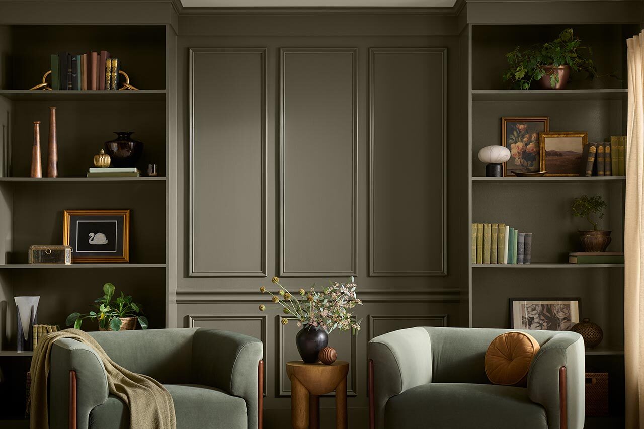
design-milk.com: Green certainly isn’t revolutionary in interiors, but Behr’s 2027 Color of the Year makes the case that there is still plenty of territory to explore. Grounded (T27-01) sits somewhere between moss and olive, tempered by brown undertones that give the shade a noticeably earthier character.


6 comments:
I never truly understood the depth of soul-crushing, unrelenting boredom until I opened an article about the Behr paint color of the year "Grounded." Described as a shade stranded between moss and olive, The more I read the article, the more boring it got. It was seriously an article about how in the middle of the day the olive tones of the color become pronounced and then in the evening the brown undertones surface to reveal deeper meanings of warming and enveloping feelings. Seriously, the article said that. Then the article went on about how the responsiveness to light was intentional and dozens of formulas and people worked to create this paint color, and then it talks about the absurdity that all interiors have to be pale neutrals when you can have “warmer, earthier and more expressive” color. And the color is the most boring shade of green I've ever seen; a visual vacuum so thoroughly exhausting that my eyes strained just to process it, and my laptop screen wasted precious battery life merely rendering its dullness. This article could have been an email. Sorry, people interested in the green paint called Grounded.
As a person who really likes the color blue, I really like the grayish blue colors in their palette called Blue Moon Bay and Denim Bay, though Blue Moon Bay leans slightly more green. I imagine that is because it complements this year's color, Grounded, which is a brown with a green undertone. But seeing the color blue just makes me happy.
I personally don't usually like bright colors, or rather extreme colors. Basically I want colors with some gray tone in them, so I really like these! I can see Grounded on the wall of a personal library, since it is such a calm color. It would be such a sanctuary, to borrow their word from the website, to read in a room surrounded by this color, and maybe with a Tuscan Terra couch, a brown with a more red undertone, it would really make the room pop!
I feel like recently the colors of the year have all been calmer colors. I think that is mainly because of how overwhelming real life is, and people need something more calming.
Even though this color might not be my own personal taste, like the article said, I’m relieved to see a shift away from “the idea that restorative interiors need to retreat entirely into pale neutrals”. The concept of millennial beige/grey is one that can definitely be seen in my parents' home, and it always upset me when I was a kid (I wanted the walls to be pink). When you google “millennial beige,” you will see people talking about how it’s a response to the maximalism of the 80’s, which I could definitely see being the case. And if that’s true, then it stands to reason that in another couple of decades, we’re going to see a resurgence in maximalism, and I am personally looking forward to that. Another thing you find when you google millennial beige is an article called “Green is the New Millennial Beige”. The author goes on to talk about how Millennials fear all color in their homes unless it's muted green. What’s the color of the year again? A dusty sage green. I guess we still haven’t escaped millennial beige completely, but at least we’re headed in the right direction.
This article title and purpose really caught my eye. With how many award shows and other programs choose a "blank of the year" I guess I should not be surprised to see that a paint company like Behr would present a color of the year. My next question on this subject is how did Behr determine this color of the year. What analytics did they compile to make a list that led to the this olive green variant being the color of the year. Was this color purchased the most over this last year, and on the note of year why is this article being made now and not somewhere around January. Would it potentially due to the Jewish New Year which occurred this week. Regardless I would really have liked it if this article also included how Behr determined this color of the year, as those numbers would have been of interest to me.
I have loved following colors of the year and discourse around them. People (me) were so upset when a shade of white was named a color of the year earlier in 2026, so it’s fun to see a move away from that. That being said, this color isn’t the farthest we could’ve moved from a neutral like white. Not that we need to be the farthest, it’s just perhaps not the most exciting shift. However, that being said, green is my favorite color, so I’m loving the deep dive into this particular shade.
I'm one of probably 5 people who actually wasn't all that upset at Cloud Dancer being named the Pantone color of the year (sure, a slightly off-white is a little boring, but I read their explanation and it mostly checked out -- also, what service does angrily tweeting about how rightfully upset you are over a pretty transparent marketing move from a paint company do for the world?). I quite like Grounded, it's a nice shade of dark green with some depth to it. My main problem, if I have any because, again, this doesn't really matter, is that moving away from beiges and greys when interior decorating is something most of the design world decided on, like, 5 years ago. So, Behr acting like picking a nice sage green is really making a statement about the latest and greatest in design is embarrassing, really. Though, last year their color was Hidden Gem (a dark, sorta rain-splattered grey), so maybe we have to just accept that Behr is just behind the times.
Post a Comment