Pittsburgh Arts, Regional Theatre, New Work, Producing, Copyright, Labor Unions,
New Products, Coping Skills, J-O-Bs...
Theatre industry news, University & School of Drama Announcements, plus occasional course support for
Carnegie Mellon School of Drama Faculty, Staff, Students, and Alumni.
CMU School of Drama
Wednesday, September 30, 2026
Artifact: Pittsburgh Paints’ 2027 Color of the Year Is a Rare Reset
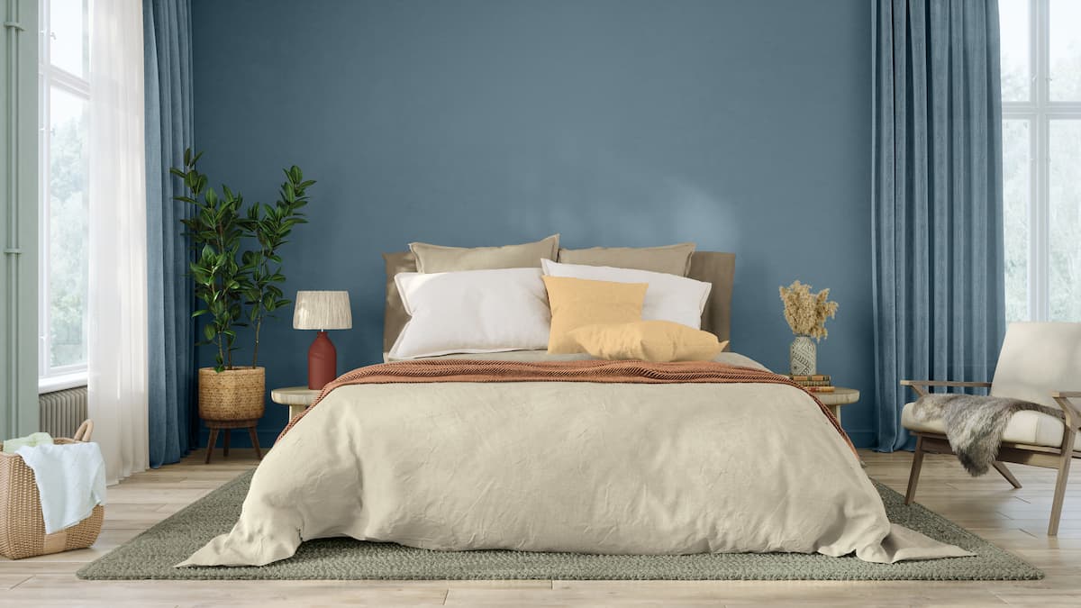
Builder Magazine: Pittsburgh Paints Co. has named Artifact its 2027 Color of the Year for both its Pittsburgh Paints and Glidden brands. Artifact, a smoky, atmospheric blue, leverages the emotional potential of color.
I love this color choice for the complete opposite reasons of the article. The article loves the color for its separation from the bold color trends of recent, but I haven’t seen those as much as a rise in grey, in monochrome and desaturation that serves to depress, not inspire. When Pantone named their color of the year as an off white, It felt like a defeat to color lovers around the world such as myself. This blue is nice middle ground I think between the people who love color and the people who love desaturation and monochrome. It’s colorful enough yet dull enough to please both camps. And personally, blue is one of my favorite colors, it’s nice to see it getting some love. I hope that this is a sign we can renter a wold that loves vibrancy and color, it’s good for our brains and just really pleasant.
I made a comment on the last article about a “color of the year” as well, and both times I found the writing a bit comical. I think it just surprises me a bit how much people can have to say about one shade of muted blue. Sometimes it feels a little like they’re projecting the state of our world onto this color, or that they’re even personifying it. But then I have to remind myself how much of theatrical design is about the intention behind choices, even as small as one color. Yes, it might seem a little silly to me outside of that context, but it’s absolutely true that the wall color of your living room can have a huge impact on the feel of that space. I would like to be a fly on the wall when they’re deciding these colors, though. I’m very interested in what that process entails.
I am personally a huge fan of the color blue. In my apartment right now, almost everything is blue, my candle warmer, my Brita filter, my knives, my kitchen towels, everywhere you look. Looking at blue just makes me extremely happy, especially when it is a calm, grayish blue, which is exactly the shade they are showing in the image. So I am really glad they named this kind of blue the color of the year, and I hope everyone feels the same happiness I feel when they see it. The one thing I actually disagree with is the idea that recent color trends have all been bold and vibrant. Maybe it is just me, but I feel like the colors lately have already been fairly calming. I think the main reason is that people want something calmer and less vibrant in their lives, like everyone is trying to settle down a bit. So in that sense this color fits right in, and I think it is a great choice.
This is my favorite color of the year I have seen in recent years. Its calming and deep, definitely seems like a good color for an accent wall in a bedroom. I feel like using this color for a whole room would make it feel small and dark, but if it was used sparingly it would work out great. I have seen many influencers embracing the concept of truly making a house theirs and painting however they see fit without worrying about resale value. When I have my own house I will definitely spend time making it feel as unique and personal as possible. A wall can be repainted before you sell a house, but you cannot replace the years of viewing a room that makes you happy every time you look at it. I personally like the look of wallpaper as it adds more visual interest to a room.
I’m not sure if I enjoy the reasoning behind this choice for Pittsburgh Paint’s 2027 Color of the Year. The article discusses the reasoning behind this color choice as if it is a complete reset from the bolder color choices in homes of previous years. I personally don’t think that this is a reset whatsoever, I actually think this is just a continuation of the new trend of monochrome and muted palettes. While the article argues that previous year’s colors and homes within the past few years have been very bold, I personally have not noticed this trend. I think that Pittsburgh Paint is just trying to follow the footsteps of other paint companies in choosing something safe, rather than what truly encapsulates the color of the year. Overall, I think that Pittsburgh Paints should’ve chosen a bolder color to encapsulate the feelings of the year.


5 comments:
I love this color choice for the complete opposite reasons of the article. The article loves the color for its separation from the bold color trends of recent, but I haven’t seen those as much as a rise in grey, in monochrome and desaturation that serves to depress, not inspire. When Pantone named their color of the year as an off white, It felt like a defeat to color lovers around the world such as myself. This blue is nice middle ground I think between the people who love color and the people who love desaturation and monochrome. It’s colorful enough yet dull enough to please both camps. And personally, blue is one of my favorite colors, it’s nice to see it getting some love. I hope that this is a sign we can renter a wold that loves vibrancy and color, it’s good for our brains and just really pleasant.
I made a comment on the last article about a “color of the year” as well, and both times I found the writing a bit comical. I think it just surprises me a bit how much people can have to say about one shade of muted blue. Sometimes it feels a little like they’re projecting the state of our world onto this color, or that they’re even personifying it. But then I have to remind myself how much of theatrical design is about the intention behind choices, even as small as one color. Yes, it might seem a little silly to me outside of that context, but it’s absolutely true that the wall color of your living room can have a huge impact on the feel of that space. I would like to be a fly on the wall when they’re deciding these colors, though. I’m very interested in what that process entails.
I am personally a huge fan of the color blue. In my apartment right now, almost everything is blue, my candle warmer, my Brita filter, my knives, my kitchen towels, everywhere you look. Looking at blue just makes me extremely happy, especially when it is a calm, grayish blue, which is exactly the shade they are showing in the image. So I am really glad they named this kind of blue the color of the year, and I hope everyone feels the same happiness I feel when they see it.
The one thing I actually disagree with is the idea that recent color trends have all been bold and vibrant. Maybe it is just me, but I feel like the colors lately have already been fairly calming. I think the main reason is that people want something calmer and less vibrant in their lives, like everyone is trying to settle down a bit. So in that sense this color fits right in, and I think it is a great choice.
This is my favorite color of the year I have seen in recent years. Its calming and deep, definitely seems like a good color for an accent wall in a bedroom. I feel like using this color for a whole room would make it feel small and dark, but if it was used sparingly it would work out great. I have seen many influencers embracing the concept of truly making a house theirs and painting however they see fit without worrying about resale value. When I have my own house I will definitely spend time making it feel as unique and personal as possible. A wall can be repainted before you sell a house, but you cannot replace the years of viewing a room that makes you happy every time you look at it. I personally like the look of wallpaper as it adds more visual interest to a room.
I’m not sure if I enjoy the reasoning behind this choice for Pittsburgh Paint’s 2027 Color of the Year. The article discusses the reasoning behind this color choice as if it is a complete reset from the bolder color choices in homes of previous years. I personally don’t think that this is a reset whatsoever, I actually think this is just a continuation of the new trend of monochrome and muted palettes. While the article argues that previous year’s colors and homes within the past few years have been very bold, I personally have not noticed this trend. I think that Pittsburgh Paint is just trying to follow the footsteps of other paint companies in choosing something safe, rather than what truly encapsulates the color of the year. Overall, I think that Pittsburgh Paints should’ve chosen a bolder color to encapsulate the feelings of the year.
Post a Comment