Pittsburgh Arts, Regional Theatre, New Work, Producing, Copyright, Labor Unions,
New Products, Coping Skills, J-O-Bs...
Theatre industry news, University & School of Drama Announcements, plus occasional course support for
Carnegie Mellon School of Drama Faculty, Staff, Students, and Alumni.
CMU School of Drama
Friday, September 04, 2026
Behr’s 2027 Color of the Year Takes Inspiration From Travel
AFAR: Travel is not immune to routine. Airports generally look the same, your coffee order doesn’t change, and checking in to a hotel is usually perfunctory no matter where you land. In order to make your accommodation feel distinctive, hospitality turns to design.
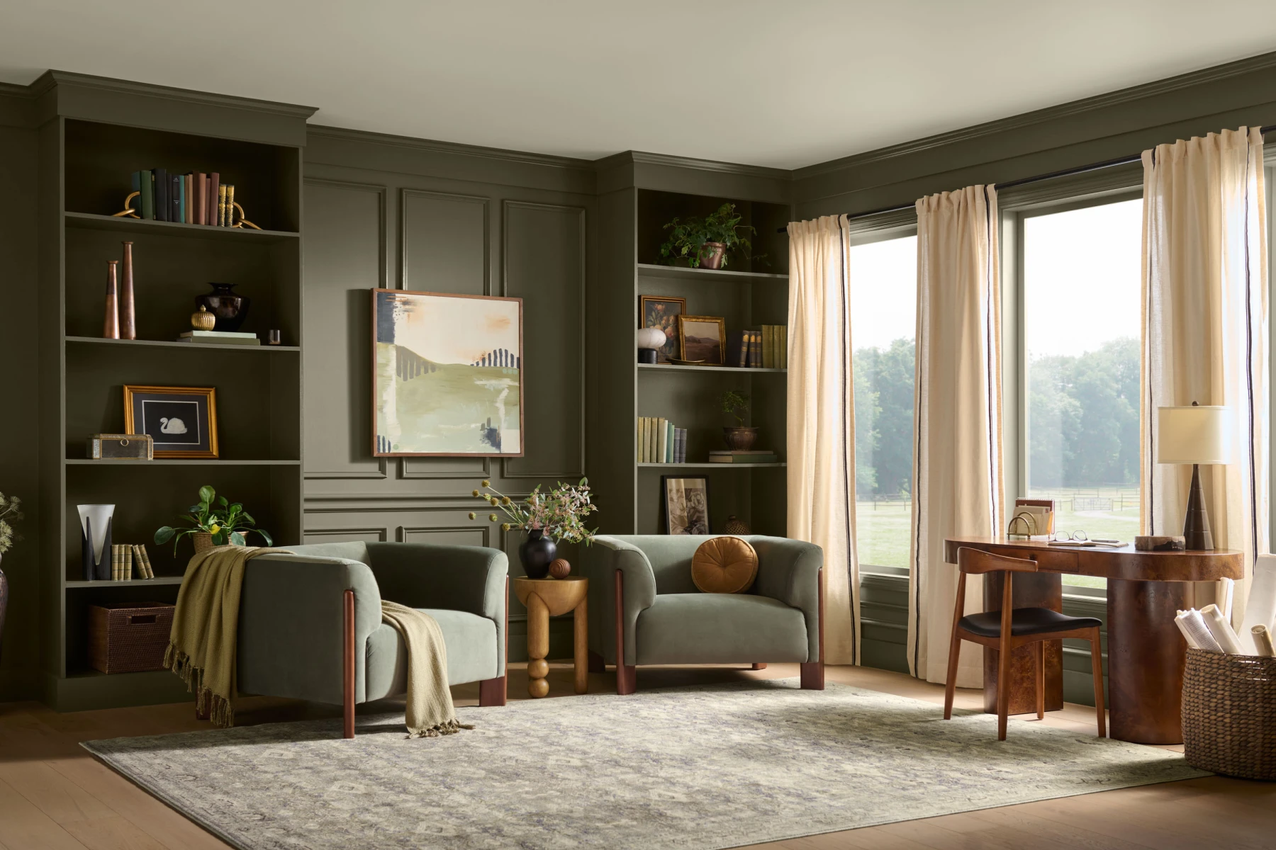
The 2027 paint color, Grounded, really showcases the increasing desire we have to reconnect with nature. Choosing a muted green that directly relates to the colors outside in Sonoma County shows the trend of trying to bring more plants and rustic elements into our homes. I like that Behr always chooses a hotel that matches the vibe of the paint color to host the reveal and from the pictures it looks like they made the perfect choice. However it is interesting how they were originally supposed to have this year’s reveal in Big Sur but had to relocate due to flooding. Meanwhile the article really highlights how unique the color and hotel is to fit perfectly in its location. The article highlights how design of hotels changes some of the routineness of travel, and the paint color being chosen to match hotels definitely shows this. The Grounded color itself is a really nice color and I can see why they think it could be popular in the coming year.
While this is such a silly concept, I'm happy Behr does something like this every year. A good comparison in my mind is how Spotify ends every year with "Spotify Wrapped," which highlights and provides statistics of your favorite and most played songs. I believe companies like Behr and Spotify do fun activities like these for one main reason. Engagement. These marketing tactics makes people excited for the product and get people thinking about the company. Additionally, I don't think this marketing is causing any unhealthy habits.
Looking at this year's winner, I must admit I'm a huge fan of "Grounded." Seeing it in a showcase room looks sleek. In my opinion, the color encourages for intimate solitude and subtly hints at luxuriousness. If this were used in a theatrical setting, I imagine it would be the paint treatment for a rich family's summer's house. For example, this could be Pyotr Nikolayevich Sorin's esate in Chekhov's The Seagull.
When I first think of this color I initially think of the home renovations I see online and the sad beige remodels that paint everything one bland color and add a muted olive green as a pop of color. And although I’m aware this is their selling point, I appreciate the idea that this green is a reflection of how more and more we crave nature in our homes. Personally, I love this color and am all for a muted green when it is accompanied by other colorful objects and furniture. I also related to the hotel’s desire to make a unique location that enhances your connection with a place. Similarly, this is a tactic often employed in theater, with the desire to transport an audience member to some other place and have them connect with that specific story. I hope that where this color is used in the future is not to add a splash of green in an already colorless room, but to create an effect of being in nature in an already colorful and welcoming space.
What a fancy name for such a basic color. However, I love "Grounded”. Green is probably my second favorite color after purple, so it seems Rich olive green is the color of the year. I feel like in the past few years I've had very neutral and really unpleasant colors, and this is also neutral but slightly more fun. I saw that they're painting this color in, like, bungalows and rooms that are in forest and mountainscapes, and I think that this color is super fitting for that and makes for a very beautiful ambiance. I do think it's funny how important the color of the year is to some people and brands. The fact that one color can determine your entire design layout is so interesting, but I guess it's not far off from what we do in the theater world, so maybe I shouldn't judge them too much.


4 comments:
The 2027 paint color, Grounded, really showcases the increasing desire we have to reconnect with nature. Choosing a muted green that directly relates to the colors outside in Sonoma County shows the trend of trying to bring more plants and rustic elements into our homes. I like that Behr always chooses a hotel that matches the vibe of the paint color to host the reveal and from the pictures it looks like they made the perfect choice. However it is interesting how they were originally supposed to have this year’s reveal in Big Sur but had to relocate due to flooding. Meanwhile the article really highlights how unique the color and hotel is to fit perfectly in its location. The article highlights how design of hotels changes some of the routineness of travel, and the paint color being chosen to match hotels definitely shows this. The Grounded color itself is a really nice color and I can see why they think it could be popular in the coming year.
While this is such a silly concept, I'm happy Behr does something like this every year. A good comparison in my mind is how Spotify ends every year with "Spotify Wrapped," which highlights and provides statistics of your favorite and most played songs. I believe companies like Behr and Spotify do fun activities like these for one main reason. Engagement. These marketing tactics makes people excited for the product and get people thinking about the company. Additionally, I don't think this marketing is causing any unhealthy habits.
Looking at this year's winner, I must admit I'm a huge fan of "Grounded." Seeing it in a showcase room looks sleek. In my opinion, the color encourages for intimate solitude and subtly hints at luxuriousness. If this were used in a theatrical setting, I imagine it would be the paint treatment for a rich family's summer's house. For example, this could be Pyotr Nikolayevich Sorin's esate in Chekhov's The Seagull.
When I first think of this color I initially think of the home renovations I see online and the sad beige remodels that paint everything one bland color and add a muted olive green as a pop of color. And although I’m aware this is their selling point, I appreciate the idea that this green is a reflection of how more and more we crave nature in our homes. Personally, I love this color and am all for a muted green when it is accompanied by other colorful objects and furniture. I also related to the hotel’s desire to make a unique location that enhances your connection with a place. Similarly, this is a tactic often employed in theater, with the desire to transport an audience member to some other place and have them connect with that specific story. I hope that where this color is used in the future is not to add a splash of green in an already colorless room, but to create an effect of being in nature in an already colorful and welcoming space.
What a fancy name for such a basic color. However, I love "Grounded”. Green is probably my second favorite color after purple, so it seems Rich olive green is the color of the year. I feel like in the past few years I've had very neutral and really unpleasant colors, and this is also neutral but slightly more fun. I saw that they're painting this color in, like, bungalows and rooms that are in forest and mountainscapes, and I think that this color is super fitting for that and makes for a very beautiful ambiance. I do think it's funny how important the color of the year is to some people and brands. The fact that one color can determine your entire design layout is so interesting, but I guess it's not far off from what we do in the theater world, so maybe I shouldn't judge them too much.
Post a Comment