Pittsburgh Magazine: What colors do you associate with the COVID-19 pandemic? Maybe black? Or gray? Possibly a bland beige?
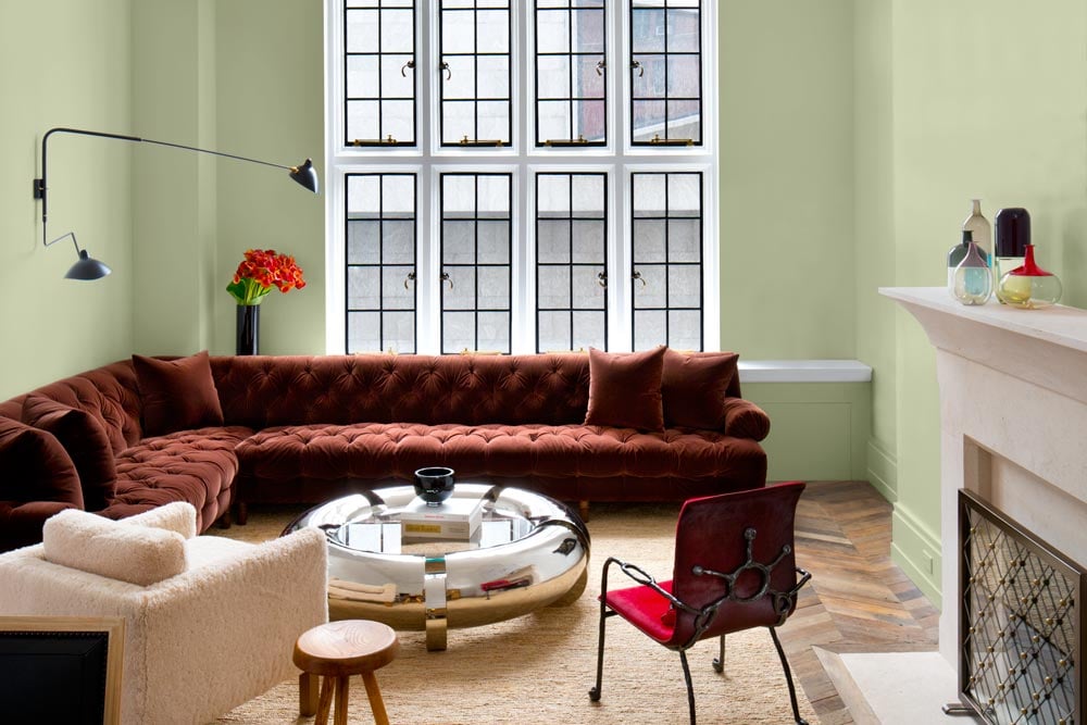
After more than a year that has included staring at walls, stay-at-home orders and little-to-no human interaction, Pittsburgh-based PPG Paints is seeing more colorful days ahead with its choice for the 2022 Color of the Year — Olive Sprig.
7 comments:
I understand where PPG paints is coming from in making a color of the year but I can't help roll my eyes a little. Being someone who color is very important to because I'm red/green colorblind, I think of things that a lot of people don't. In the past 6 years (2016-2022, not including 2021 where no paint color could be found), PPG paints has chosen 3 colors that are in the 'green' family. I understand that it's a vast minority of people who are colorblind but it brings to light a much larger conversation that I seem to be the one to always bring up in the world of theatre. The fact that so many technicians who are in charge of paperwork think that it's okay to load their paperwork up with bright colors. It's not only bland for the minority of us colorblind folks, but it can also make paperwork illegible or defeat the point of the colors entirely (For example, using red to symbolize stop and green to symbolize go).
It is interesting to look at how design changes after and through major events in history. It allows us to see how society reacts to the hardships as well as the good times. To be honest, it makes perfect sense to me that people will be wanting more color in their life, as I would consider myself one of those people. Over the course of the last year and a half I found myself switching out my white shower curtain for a yellow, blue, and green flowered one or my white bedsheets for light green ones. Even though some popular home designers were still using a neutral colors to design homes I found myself wanting to add more color to my life. It was a slow progression but I would say there is a lot more color in my home that there was March of 2020. People are affected by what they are surrounded by and I think a light green, such as “Olive Sprig”, does have a great feeling of rejuvenation that people need to move forward and recenter.
What a beautiful color this is! It reminds me of a spring picnic and the smell of the air in the early morning. I absolutely connect this color to the symbolism of “healing and regrowth” that PPG Paints described in the article. I think after the last two years, each and every one of us deserves softness, happiness, and time to rebuild. With a much-increased focus on preserving mental and physical well-being during an unprecedented social-political upheaval, even things like a lovely paint color can help. Self care is a flexible, unique practice person-to-person, and it can absolutely include using things like decorations, lighting, and even paint to make the spaces you live in day-to-day into comfortable places for yourself. This color is a sweet way to tribute all of the mental and physical suffering the world has been through, and the resilience we have needed to get through it.
I had absolutely no clue this was something that PPG Paints does every year, but I love it. I think it is a great idea. Now, it is definitely a gimmick and it really means very little in the grand scheme of things, but it is something fun and cute that I am sure people look forward to. I think trying to make the choice of color relevant just adds to the fun and does give it some meaning. I like the choice of a green-gray in attempting to symbolize re-growth and recovery after the last 18 months. Reading more into the article, I was intrigued by the brief history lesson. I didn't know any of it. I had no clue that large historical events had any correlation with people's choice in pain color. That being said, conceptually it makes sense. Its interesting to see that there is most likely some actual data behind the concept as well.
When I first saw the photo, I immediately thought “what an...interesting color”, as that is not a color I would ever paint my house. I don’t really see their justification, and it just seems like a way for them to sell paints, but I suppose people like it. I really like the question that the article starts with and wish that they had gone a little further with that and given more perspective than what they provided in the article. I did like the small history segment about what the focus for housing features were during World War I and the Renaissance and I find it interesting that it seems that the focus for today is simply colors. I don’t think that’s the truth though and would be interested in seeing what the architectural focus is. I do not also agree with the “rebellion” comment. I think that if they wanted an “optimistic” color to be prominent, they would have chosen one.
This "olive sprig" or sage green color has also become one of my favorites. I find both pastels and greens to be very soothing, so this is the perfect mix of the two. It also does not compromise sophistication. I've heard that having plants in a home can improve the demeanor of the people living within it, so I wonder if the color plays a part in that. I've been incorporating more and more green into my living spaces, a color I steered clear from as a kid. I'd be interested to learn about how color preferences change over time, and why we as adults shift more into the neutrals. The term "olive" in the title is smart because it makes me think of an olive branch, also known as a peace offering brought by a dove. I'm not sure if this was intentional, but I'm sure others will notice as well. Additionally, any green room in a theatre that was actually painted green was some variation of this tone. This makes sense for a casual, resting area.
I did not even know that PPG Paints released a Color of the Year and I suppose this years winner must mean a lot considering the circumstances that we all have been through. Olive Sprig, in my opinion, is a beautiful color that really presents the emotion that this article hopes it does. This pastel green is one that does not impose on its surroundings but offers a warmth and coziness without demanding traditional yellows and oranges. The color of a room really sets the tone for the house and the company and the sense of community I feel from this shade of green is really successful. Do I think that PPG Paints and the color is a big deal when it comes to the pandemic? No, but I do think we all realized how sacred our home really is and any measure it takes to make people feel more comfortable and happy in their home is a huge and necessary step to make.
Post a Comment