Builder Magazine: It’s that time of year where design trends experts and paint manufacturers have begun predicting which colors and color families will make a statement in homes in the coming year. Recently, three more brands within the Sherwin-Williams Consumer Brands Group, including Minwax, HGTV Home, and Dutch Boy Paints, announced their selections.
7 comments:
I knew that usually there is a color picked for the year, but I didn't know that there are different brands that make this decision. I think it's interesting that usually they are the same, but this coming year they all predicted something different. I wonder why this is. I’m not sure how I feel about the Minwax color. To me, the blue is a little harsh and not as relaxing as I would like. On the other hand, I really like HGTV Home’s Persimmon. I feel like it is really pleasing to the eye and it definitely is a color that I have been seeing a lot recently, especially in home decor. I also have always liked dark green for interior design, and I think Dutch Boy Paints’ deep olive green is so peaceful. Green is very calming and reminds people of nature, which just adds such a lovely touch to an interior. I do wonder how these colors are chosen and how calculated they truly are. It would be interesting to go back and look at past predictions and see how accurate they were.
This article was very interesting and eye opening to my personal tastes and preferences when it comes to interior design and color. I love color and color is my favorite medium to work with whether in light or as an accent color or an all over color, I very much express my ideas and self through color. I was very intrigued by the stark differences between the 3 colors chosen. My favorite of the 3 was Bay Blue, the color of the year for Minwax. I loved how this blue made the wood accents pop without being abrasive to the eye. But different enough to be fun and playful. Next I liked Dutch Boy Paints’ color of the year, Ironside. I appreciated the all over quality of this deep olive green. I am a fan of dark academia which is very much what this color is representing for me. The one downside I have with it is that you couldn’t really use it for more than one room in a house which I love, however I feel like for a color of the year it should be able to appear throughout the home as the through color and I just don’t see Ironside as that color. Lastly, I was very disappointed in HGTV Home’s color of the year choice with Persimmon. I feel like this color would work great in a New Mexico or southern California home, but I struggle to see this color be successful in a cooler climate, which is why I find it a strange choice for color of the year. I see what they are trying to do with an in between of terra cotta and tangerine however it looks far too much like salmon to me.
I find the contrast between the colors picked for this year to be interesting. Personally I am more drawn toward the rich blue stain that minwax declared their color of the year. I think the fact that it's a stain makes a huge difference in how my eye receives that color and I am not sure how much I would have liked it if it was a paint. I do find the persimmon color HGTV Home picked to be a bit of a wild car. It seems like the whole internet is into very bold or rich earthy colors. The persimmon color isn’t quite earthy enough to achieve that and I wonder what in their research led them to believe that this color would be this year's color. I would love to know the data analysis/research and projections each of these companies goes through to make this decision. Do they conduct research on instagram home making trends? Do they look into the psychology of color and try to predict what this year's color should be based on their customers' needs or is it simply that they made a new color they are trying to sell
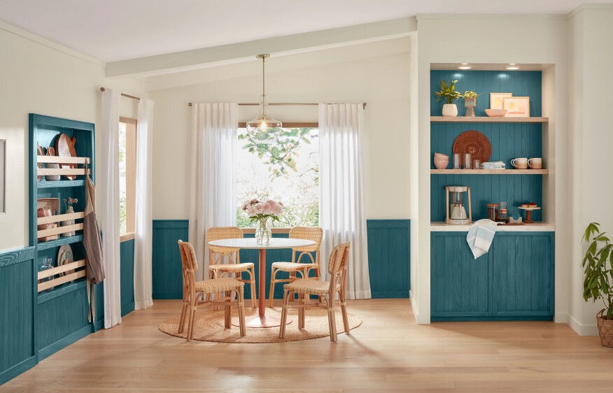
I hadn’t heard about this before the article, but apparently there are colors that brands pick each year that they think will be popular based on the design trends of the previous year. Recently 3 companies announced their colors for the year: Minwax, a dusty medium blue called “Bay Blue”, HGTV, a peachy earthy tone called “Persimmon”, and Dutch Boy Paints announced its pick as a deep olive color called “Ironside.” Dutch Boy Paints had the most interesting concept for their color announcement to me, as they said that “ironside” took “a natural approach to healthy living and safe spaces,” and I had never heard a color described like that before. I don’t really associate such a dark color with softness and safety, moreso with danger, but the promotional photos showcased in the article definitely look appealing and comfortable. I think color announcements are a little bit silly, especially since we have technology to perfectly recreate color based on an image.
Colors of the year have always been intriguing to me. Why are certain colors better for different years? I will never know. Sherwin-Williams has released its 2024 paint color trends which feels like a lot of colors to be THE colors of the year but who am I to say. Not the paint expert here. The palettes include blues and greens, reds and purples, deeps and darks, and delicate tints (a lot right or am I being too restrictive?). These colors range from calming and invigorating to bold and powerful, allowing anyone to create different atmospheres and moods in their space while still of course, being on trend because what could be more important than that? I am interested to see if any of these colors actually imprint into next year or if they are just more for the press of it all. I really liked the dark green color if anyone was wondering.
I’ve heard about the Pantone color of the year before, but I’ve never considered that other color companies probably also participate in the same marketing trends. I’m curious about the process for deciding what the “color of the year” is. Particularly since each of the three brands selected very different colors for what they consider the color of the year to be, I’m skeptical to assume that there’s that much science behind picking the color. It leads me to believe that the person in charge of the “color of the year” committee might just be picking their favorite color, or just trying to boost the marketing around a color that hasn’t been selling too well. Personally, my favorite is the olive. I think that the persimmon color is uncomfortably fleshy and the teal seems a little too much like a color in a child’s bedroom, rather than something I would consider for my fancy house. I disagree with the concept that the teal stain brings out the wood’s natural beauty since I think a lot of the natural beauty in wood is found in the wooden colors and that covering them up with a clearly unnatural color just looks cheesy.
The color of the year is such an interesting concept because I can never tell exactly what it is supposed to correlate to. I wonder if you took a snapshot to the past ten years and put it in front of a millennial if they could tell what colors came from what year since that age group would have been consuming the most modern media in the past decade. As someone who no longer designs, I am intrigued to see how the color of the year will circle back in the arts, especially with scenic and costume designs. Will we as a community and society begin to correlate colors with certain decades? Off the top of my head, I would think something like a yellow would correspond to the sixties from some reason. Or will it be more of a hue that relates to a decade, with the sixties being bright and the nineties being darker and moodier. From these three colors, albeit all of them are very different, do have some consistently like being on the muted side of the color scale.
Post a Comment