Community, Leadership, Experimentation, Diversity, & Education
Pittsburgh Arts, Regional Theatre, New Work, Producing, Copyright, Labor Unions,
New Products, Coping Skills, J-O-Bs...
Theatre industry news, University & School of Drama Announcements, plus occasional course support for
Carnegie Mellon School of Drama Faculty, Staff, Students, and Alumni.
CMU School of Drama
Friday, February 18, 2022
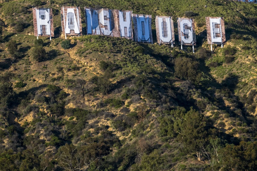
'RAMS HOUSE' Hollywood sign change is an illegible mess
Los Angeles Times: The reviews are in for the new Hollywood sign, now allegedly reading RAMS HOUSE in commemoration of the Rams’ Super Bowl victory, and they are scathing.
“Just pure chaotic perfection,” TikToker and TV producer Dana Alyss wrote on Twitter.
Subscribe to:
Post Comments (Atom)

3 comments:
This article was absolutely hilarious. I love it so much. The intent behind changing the Hollywood sign to say "RAMS HOUSE" is in itself kind of funny to me, but the fact that it was a two day event and that the rams football team was footing the bill for this absolute flop makes the whole situation ten times funnier. The redit thread in itself is one hundred percent worth a scroll through and has some absolutely hilarious comments on it. Honestly the issue looks like it is just a cheap material used to cover over the signs. It just looks see-through. The fact that the actual sign is showing through completely ass opposed to the guy who changed to sign to read "hollyweed" a few years back is almost embarising. This rams advertisement was a two day long project, funded by the football team, and is being beat out by one guy making a weed sign overnight is the best thing I have read all week. Thank you for this article making my day.
I had no clue that even happened and I am from Los Angeles. Man does it look bad though. Like I understand wanting to celebrate the win for the community, but the article was right the more you look at it the more it doesn’t look like it says “Ram’s House.” This project also made me think of when someone changed the Hollywood sign to say Hollyweed. It’s funny to me that a prank genuinely looked so much better than something that was official and even announced by the mayor of Los Angeles. I think the main problem is that the real letters are still clearly shown behind the banners that they used. It was a nice thought just the execution was lacking, but to be fair that is a tough job given that each letter is 44 feet. At least the sign got people talking even if it wasn’t for the reason they had hoped for.
To be honest, I hate that this makeover of the sign exists. Not only is it ugly, but its sanctioned by the city and backed by a massive coorporation. Why must commercialism infect everything, like can’t we go back to the days when only crazy vandals were redoing the Hollywood sign? Like, that is interesting, and it is a much better piece of art than whatever this is. It has something to say, even if that something is HOLLYWEED, it's still a big middle finger to the city who owns that land and makes it private and inaccessible to the public. Now this, the city has taken inspiration from people that it punished before and did what they did, but worse! This is why I think art should be made by independent people because when it gets too commercialized we get headache inducing nightmares like this stupid stupid reskinning of the hollywood sign.
Post a Comment