Community, Leadership, Experimentation, Diversity, & Education
Pittsburgh Arts, Regional Theatre, New Work, Producing, Copyright, Labor Unions,
New Products, Coping Skills, J-O-Bs...
Theatre industry news, University & School of Drama Announcements, plus occasional course support for
Carnegie Mellon School of Drama Faculty, Staff, Students, and Alumni.
CMU School of Drama
Tuesday, February 22, 2022
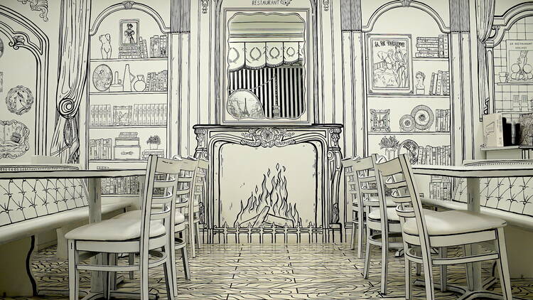
Check out a Lakeview restaurant covered in amazing illustrations
www.timeout.com/chicago: Ambiance has always an important part of the experience of dining at a restaurant, but it's no longer enough to simply hang some art on the walls and light a few candles in the evening. Thanks to the rise of social media and experiential pop-ups, decor and theming has become just as important as what's coming out of the kitchen—just look at the dazzling curtains and greenery at Alla Vita or the cozy Euro-style café character of GoodFunk.
Subscribe to:
Post Comments (Atom)

3 comments:
This is such a unique concept and I’ve never seen a restaurant decorated in this way. The one issue I see with the decor is that it would be very obvious when there is a food smear/stain on the white surfaces, so hopefully everything is able to be easily wiped down to keep the restaurant looking clean and tidy. If I were a little kid I would have loved to come here, it seems like a great place for families. It is a great opportunity for coloring sheets/menus for kids, although they might be tempted to start coloring on the walls. One of my favorite details of the interior is the “tufting” on the bench, it bumps up that illusion of illustration. This was a really smart way of adding interest and decoration to a space without necessarily having to buy a bunch of wasteful furniture, knicknacks, etc.
This is such a trippy and mind boggling experience to have in a restaurant! This is such a great way to promote artwork as well as promote this art style to a wide variety of people. I would definitely want to visit this restaurant once in my life, and its style definitely makes it a tourist stop. It would also attract lots of people who want to take photos for a shoot or an instagram photo. However, I think that if I were there it would make my eyes hurt after a bit, so I don't think I would be able to stay long term. Therefore, I believe that it is a perfect little cafe and very fitting that they sell finger food like donuts and treats. It is a great reenergizing stop for your afternoon if you are touring the area. One thing about the design that I found interesting is that they have so many furniture items aside from traditional cafe seating. The bath tub particularly caught my eye, and why I think it would be a great place for a photoshoot.
This is so beautiful. The detail it takes and artistry is astounding, but beyond that the message and impression it leaves on us as viewers is quite profound. I would imagine that sitting in this restaurant would bring you a greater appreciation for your surroundings. I find that as I grow older I lose a lot of the appreciation I had for the little things around me, and as I try to foster that gratitude back into my daily practice, instances like this really move me. I am curious as to what inspired this, and how one feels sitting in this. How does the way you look in this context change, I would imagine people would become almost like caricatures as they sit in this silly black and white cartoon world. It speakers to the power of design, and the strength that it has to move and hold us in the world.
Post a Comment