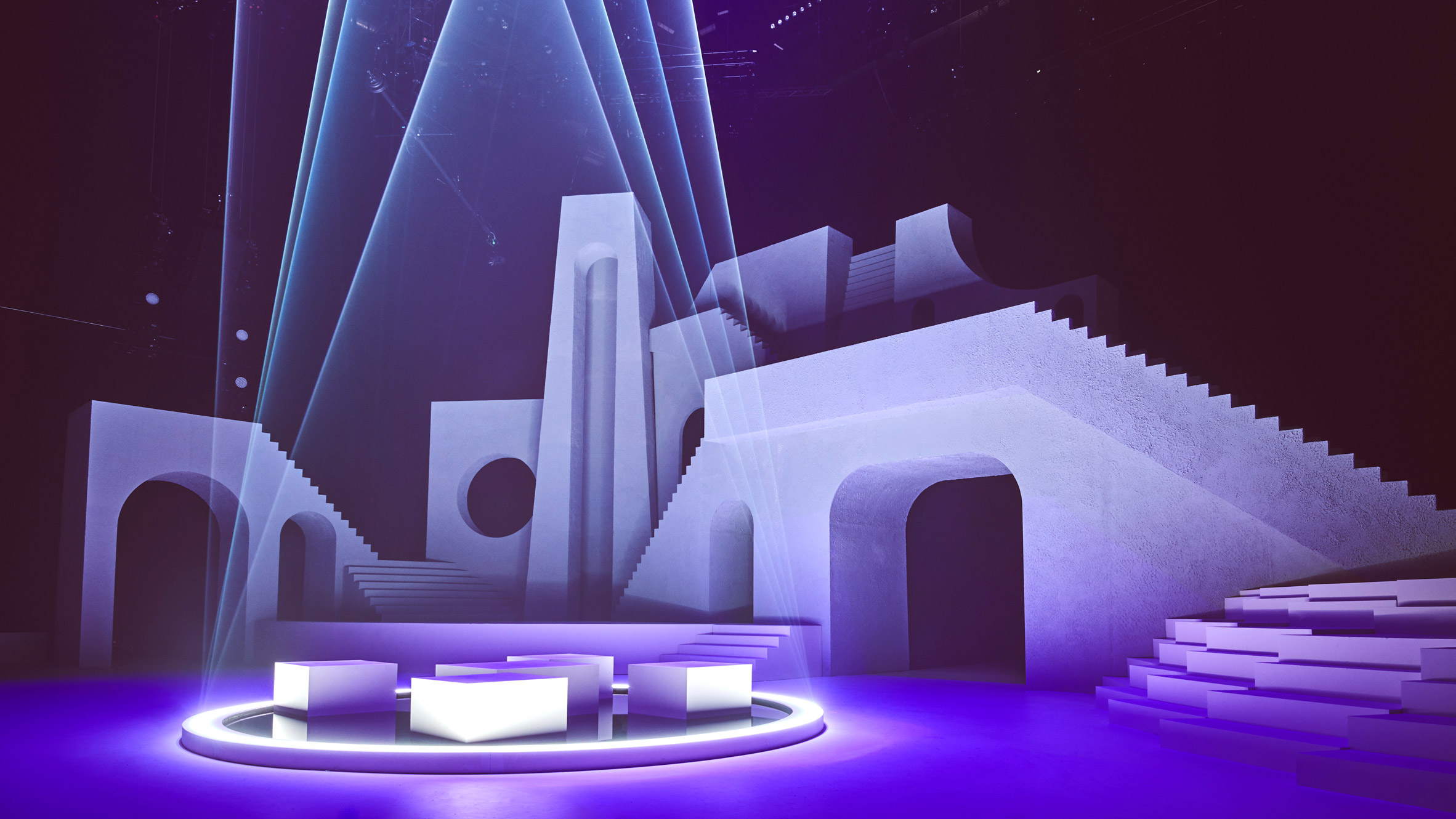
www.dezeen.com: Canadian designer Willo Perron created a a "mash up" of architectural iconography for the set design of Rihanna's Savage x Fenty show at New York Fashion Week.
Singer-turned-businesswoman Rihanna presented her fashion show as an hour-long music and dance performance on a stage filled with exaggerated architectural elements.

5 comments:
When I first looked at the image of the set I thought of Moroccan architecture and low and behold that was the inspiration. I think the set looks amazing! I love the simple yet complex components and I really enjoy how cohesive it looks. The lighting is also subtle and I enjoy that they didn’t go overboard with the concepts. I love the white set that allows a lot of creative work with the lighting. I like how they are bringing the theatrical components to fashion design!! It's very cool to see how they are switching things up on how they present their fashion and it fits well with Rhianna bring a performer turned businesswoman. “Phones were banned from the venue and the live show was recorded and streamed via Amazon Prime a week later.” I think this is very ironic, a few weeks ago I commented on two articles about the controversy of Rhianna and a play write talking on twitter during a show. I do like how the designers kept the audience and their attention in mind.
SAVAGE x FENTY IS MY FAVORITE. I think Rihanna is a brilliant business woman. I think that the set design for Rihanna’s lingerie line that is walking fashion week (which is an incredible accomplishment on its own) looks amazing in the photographs of this article. Presenting a fashion show as an hour long music and dance performance accompanied by exaggerated architectural elements sounds so much more interesting than any old fashion show at New York Fashion Week. I also love how thoughtful the design elements are in taking into consideration the fashion line’s influences. I adore how they basically made fashion week into a mini performance. I think that the set design itself is extremely minimalist, and the lighting design looks really beautiful. It looks like something you would find in Greece or Morocco which is really cool. It’s basically a modern set made for a modern and less theatrical purpose than theatre.
It makes sense that if the fashion show has turned into a performance, the design of the space it happens in must also expand to be a performance space. I think that Willo Perron did an excellent job at creating a variety of levels for performers and interesting shapes and structures that catch the eyes of the audience. I like how geometric everything is while also not feeling completely harsh – incorporating both curves and sharp corners, along with the sort of blended stucco texture help create this atmosphere. I can only how much the lighting designer went to town with colors and patterns on this beautiful blank canvas of a set. This pictures of this set immediately reminded me of scenic design renderings from designer Adolphe Appia that my Introduction to Scenic Design class looked at last semester. He also used blank landscapes with interesting geometric and architectural structures.
Woooooow this is cool. I love the transformation from a traditional runway to incorporate such interesting shapes is really exciting. I think that the levels, angles, and structures that have been created give such a dynamic presentation of Rihanna’s work. I appreciate the elegant balance that the scenery has; it complements the clothing being showcased in a really powerful way. The development of this into a performance is a movement that I find really exciting. You don’t often hear about the ways in which a fashion show is presented differently or is transformed, and I think this took the audience’s full experience into account, which goes to show how strong the team behind this show was. I feel like this team really considered all of the ways in which they could push the entire presentation of the clothing further to not only showcase Rihanna’s work as a designer, but also to engage the audience and inform them of the greater aesthetic and goal of the collection.
I can be pretty picky about the set designs I like and the ones I don’t. Sometimes I feel simple architecture can look high school play-ish or lazy. For the case of Rihanna’s show, I actually think it worked wonderfully. I loved how it was inspired from the destination, but what I appreciate the most about its simplicity is how it allows the focus to be on the lingerie. It also allowed lighting to have fun with its programming with an all white canvas to work with. When it comes to a fashion show, the area in which the outfits are presented set the mood for the collection to come and I feel this design did a great job of that. It’s obvious when looking at the photos that it was a beautiful show with excitement and colors. It goes to show how the skills we learn at CMU can apply to industries outside of theatre and create effective art.
Post a Comment