Community, Leadership, Experimentation, Diversity, & Education
Pittsburgh Arts, Regional Theatre, New Work, Producing, Copyright, Labor Unions,
New Products, Coping Skills, J-O-Bs...
Theatre industry news, University & School of Drama Announcements, plus occasional course support for
Carnegie Mellon School of Drama Faculty, Staff, Students, and Alumni.
CMU School of Drama
Tuesday, February 11, 2020
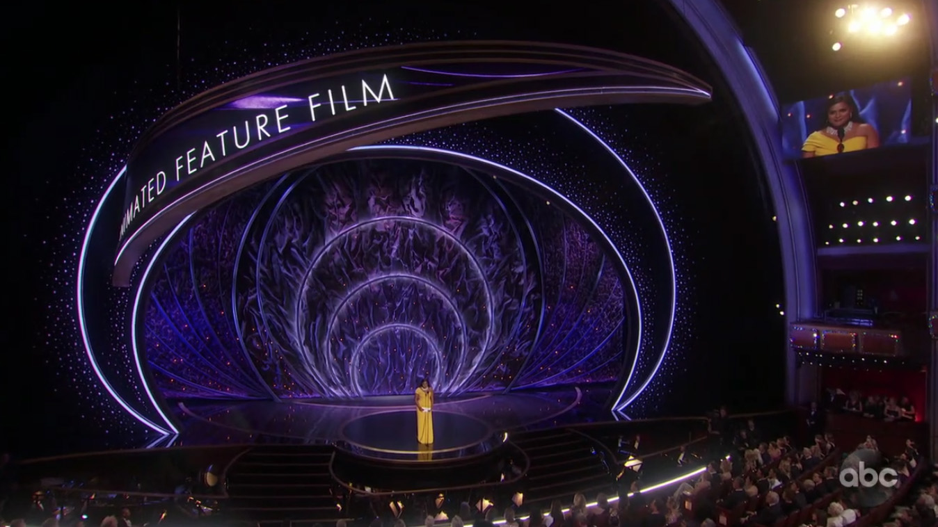
Oscars get big update with swaths of LED ribbons, video walls
NewscastStudio: The 92nd annual Oscar awards Feb. 9, 2020, added a tech driven twist on its production design that kept the crystals and Oscar silhouette themes that have become mainstays for the awards show but added a myriad of LED panels mixed with hard scenic elements.
Subscribe to:
Post Comments (Atom)

3 comments:
As like most people in the Purnell building, I spent most of my Sunday evening watching the Oscars. What I absolutely loved about the Oscars this year was the set design. I was so excited to see it with the 50,000 diamonds that is apart of it. However, I was totally unprepared for how much the set changed throughout the broadcast. The set changed in amazing ways, with the big vertical swoop down the middle of the stage that could hold people. I found it particularly impactful when they used it for the performance for the Harriet song that was nominated. The vertical column also twirled while going flying in and out of the stage, giving a sweeping view of the beautiful diamonds hanging from it. The ginormous wall of LED screens that was curved was also amazing. I loved the hand drawn look of the name plates of the nominees. I also thought it was a good use of the screens to incorporate the set and screens together for announcing the nominees as well as when performances happened. Elton John's performance was great, but the animation behind him on the screens fully captured my attention. I thought it was an amazing use of media.
First of all, the most amazing part of the entire Oscars was the set design. It was visually stunning and I’m pretty sure that was the only thing I could look at the whole time. I love that ABC decided to film the video content from the set, because it was truly a beautiful composition of media. They could have just shown the videos full screen in the broadcast, but it was a really cool experience to see the media content wrapping around the set, mimicking the design of the center spiral structure. It all seemed to fit together in such a natural and unique way, which I really loved. To me, this was a great composition of hard scenic elements with media. It is easy in productions like these to design the scenery solely based on the screens, but it was like everything was built to so naturally fit together. I really loved this design.
The media implemented into the Academy Awards set was amazing. First of all, the LED panels were implemented into the various set pieces so flawlessly and seamlessly. Had the panels been powered off, they would simply disappear into the set, invisible to the passive observer. In addition, despite the rather odd and irregular layout of panels, the media design worked so perfectly with said layout and created a beautiful overall display. My personal favorite part of the media was how it was implemented on the massive upward helix. At points, there were graphics which began at the bottom of the helix on stage, traveled up the inside of the helix, then continued upwards on the outside of the part of the helix that extends past the proscenium. The transition from the onstage piece to the proscenium piece was flawless and really completed the illusion for me. I’d be interested to learn the process of designing and implementing something like this. Are the panels stock, flat panels that are just installed in a particular way to give the illusion of a curve? Or are all the panels custom built on a curve, created to the specifications of Jason Sherwood’s scenic design?
Post a Comment