Community, Leadership, Experimentation, Diversity, & Education
Pittsburgh Arts, Regional Theatre, New Work, Producing, Copyright, Labor Unions,
New Products, Coping Skills, J-O-Bs...
Theatre industry news, University & School of Drama Announcements, plus occasional course support for
Carnegie Mellon School of Drama Faculty, Staff, Students, and Alumni.
CMU School of Drama
Wednesday, January 19, 2022
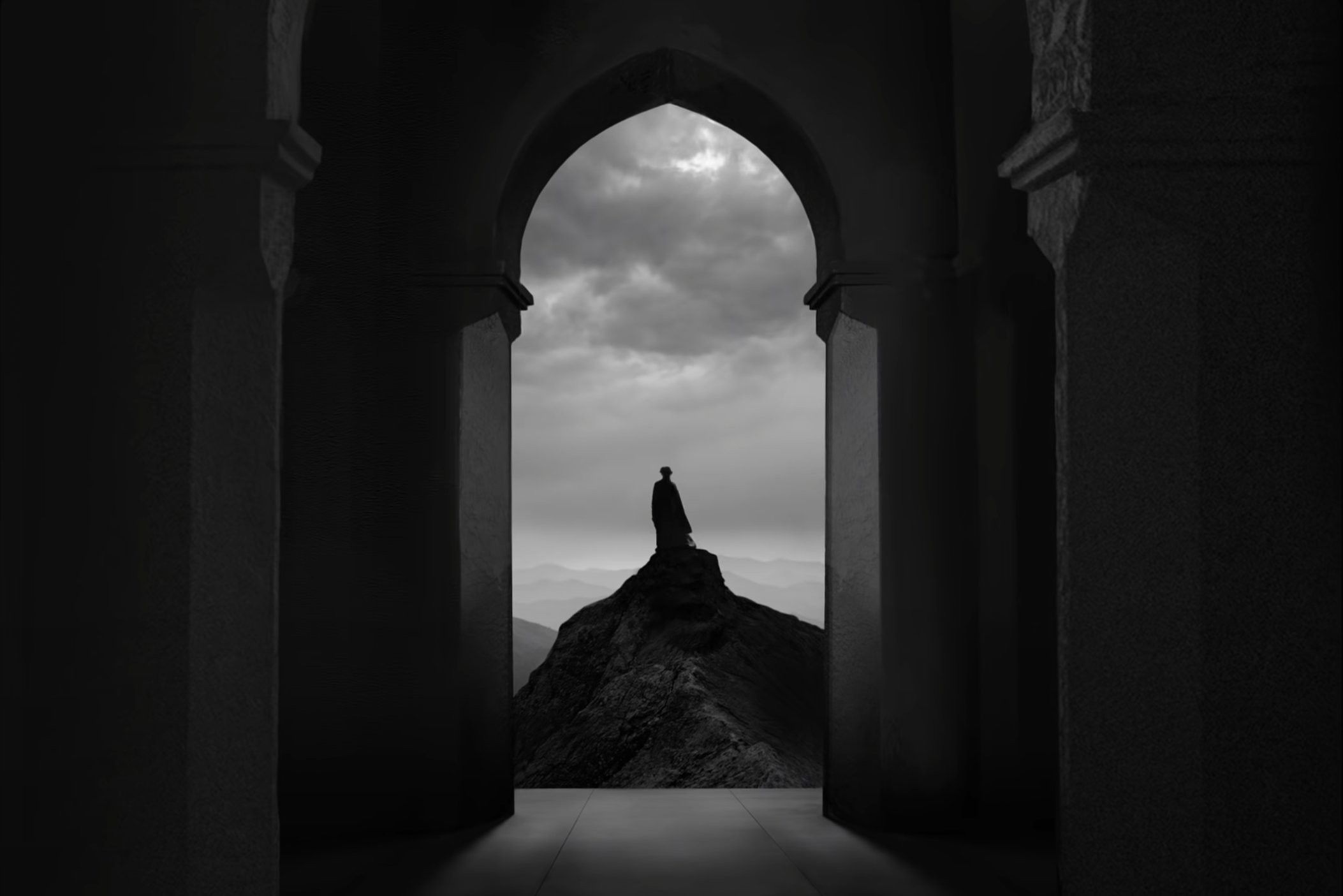
You Can "Carve Spaces" in Unbelievable Ways Through Production Design
nofilmschool.com: You haven't seen anything like The Tragedy of Macbeth. Writer/director Joel Coen and cinematographer Bruno Delbonnel reference films you probably know, like Fritz Lang's Siegfried, Carl Theodor Dreyer's The Passion of Joan of Arc, and Charles Laughton's The Night of the Hunter, and they take a foundation laid by German Expressionism to create an entirely new world for the tragic King of Scots.
Subscribe to:
Post Comments (Atom)

4 comments:
At first I was surprised to read that this was not talking about a scenic design for a theatrical production, but it was for a movie! Making 35 sets sounds like a crazy feat, and I was intrigued to read about the differences of making a set for a theater versus a film studio. It surprised me that 35 whole sets were able to fit inside the studio space of the warner bros. I really appreciated how the article took us through the design process. Having quotes from the scenic designer, Dechant, I learned how he communicated with not just the director but the choreographer and really got to see the collaboration of the creative team. I found it interesting that the pictures were black and white. It was an aesthetic choice that surprised me and that they would showcase the set through black and white, but it ended up really adding to the aesthetic of the piece and helped me see the vision of the artists involved.
Hikari Harrison
I think as someone who has worked with Shakespeare for most of my theatre career”, it’s interesting to see how those scripts are utilized in movies. This is especially true Shakespeare’s work utilizes the physicality of live performance in its’ text. For Macbeth, whose most famous line is from a monologue, this relationship with the audience is especially crucial. I think they get past the live audience roadblock by transitioning the emotions that actors convey to the audience through energy into emotional expression through the designs. The stylistic choice to use black and white allows for a less realistic, fantasy type feeling. This allows the audience to project intensely onto the characters immediately without having to see their inner machinations. I also like the usage of the set as a representation of Macbeth’s thoughts and feelings because it also allows the audience to get a more visceral idea of how Macbeth feels. I don’t know what they did with the text, but I think that using the set that way will compliment the acting the same way physical presence does within monologue scenes.
In my experience, Shakespeare done in the form of film has often been heavily scrutinized and judged for their inherent lack of a live performance element or audience. This does make sense, as the inimitable feeling of theatre is the foundation of a majority of Shakespeare’s plays. Stefan Dechant’s interview makes clear that although he appreciates the artifice that many theatre productions are able to effectively utilize to tell a compelling story in a carefully crafted world, he took a different perspective in designing his film. Dechant instead chose to focus much more on controlling how the audience views the film (through angles, cinematography, and “abstraction”). I’ve never watched The Tragedy of Macbeth, so I can’t say if I found Dechant’s designs to be comparable to a live production of Macbeth, but I think it’s also worth noting that the film and theatre version of a production are too different in execution and design to be examined closely side-by-side.
I need to see The Tragedy of Macbeth, as the Shakespearian story is one of my favorites. I absolutely love that they took the classic Shakespearian story and from that created an unconventional yet sunning film. I thought that changing the colors of the film to Black and white is a very cool idea that isn’t done too often. I also was stunned at the almost theatrical esc sets that are seen within the film. The idea that the sets are more there to reflect Macbeth’s inner turmoil adds to the films dreamy and theatrical qualities. I also found it interesting that this type of film design was used in lots of old German expressionist films such as Dracula. This way of storytelling though film almost feels like a mix of theater, film, and cartoon as the sets are meant to be unrealistic and are not meant to look real. The lack of detail and emphasis on shadow is also incredible because it forces you to look at the dramatic shapes created by the set instead of overwhelming you, as a lot of films can do. Making 35 entire sets all within one studio is also no easy task, but form what I can tell they did an incredible job in transporting the audience to a world that feels more dream like then real.
Post a Comment