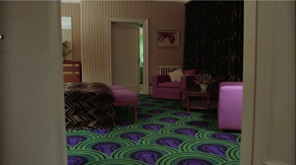
Film and Furniture: Considerable attention has been bestowed upon the iconic hexagonal carpet that lines the corridors of The Shining‘s Overlook Hotel, but what of the infamous Room 237 carpet? Join us as we investigate the captivating carpet and design details of Room 237 and ask renowned film set decorators and interior designers to share their thoughts on this most foreboding of hotel rooms. We also show you where you can buy luxury versions of the Room 237 carpet, rugs and runners for your own home.
6 comments:
I first saw the Shinning in 2018 for a friend's birthday party. It was one of the first horror movies I saw, and immediately I loved it. I thought the tension building was phenomenal, and loved the atmosphere the movie created. I specifically remember loving the set, as I thought it really elevated the overall unsettling nature of the piece. The hallways felt long enough that you could get lost, the common areas where tall and daunting, the hotel rooms felt uncomfortable and cold. Then there was the infamous room 237, which was one of the major interest points of the film, as a mystery revolved around it. This article helped me finally put into words how exactly the set design of this room achieved such an unsettling feeling. I often struggle to name what I am feeling. I was able to better process how the scenic designer used specific tools, and getting to see how those tools were executed better helps me understand how to approach creating mood from a set design standpoint.
I'm going to embarrassingly reveal that I've never seen The Shining or read it because I'm a baby who hates scary movies. But I am a little familiar with how the story goes of like a scary hotel that strange things happen and there are twins and like, "here's johnny!" or whatever. Anyways! The article, a very cool read about what actually went down at the Overlook Hotel and how the production design for the different ways the rooms presented to all of the characters was a very interesting read. Like in the article when they were talking about all of the vibrant colors that "assault the senses". It's an interesting design choice because we wouldn't typically associate bright colored things to be threatening, but in almost every photo in the article of the Overlook it wasn't a dark color palette. It's a cool case study of color psychology and making our brains trick us and make think we're safe, but I don't think anyone's safe in a sketch ass hotel with creepy twins.
I remember watching the Shining a few years back and it haunted me because of its tension building up as the story progressed rather than its characters. I think a lot of the tension, as the article talks about, comes from the aesthetic of the film, and this includes its cinematography, costumes and set decorations. When I was watching the film, I remember seeing room 237 and knowing immediately that it’s a special room because it looks nothing like the rest of the hotel – its vibrant colour palette could not be more different from the brown and red of the hotel. Reading this article made me realise how all of this was a design decision that was meant for the audience to feel unsettled and trapped, much like the Torrance family in the movie. The article talks specifically about the carpet, which adopts a 70s vibe, is already outdated for a film released in the 80s. But I personally feel that this adds on a certain level of realism, making it harder for the characters and the audience to tell the two worlds (the room from the hotel) apart.
I had the unfortunate experience of having to watch The Shining for my sister’s 9th grade film final because she was too scared to watch it alone. I found the film’s unsettling ambience to be actually quite different from the few other more recent horror films I’ve managed to sit through. Back then, I didn’t pay as much attention to the technical and scenic elements of the film; I just sort of chalked up the constant feeling of unease to the gore and creepy twins. But reading the article, it actually makes a lot more sense how specific design choices such as the colors and pattern of the carpet of Room 237 influences the suffocating mood of the film. The stark contrast between the color palettes of Room 237 to the rest of the hotel and film environment does an excellent job in forcing a feeling of disorientation and surrealism, a fitting pairing with the tense plot.
The Shining has some of the most iconic sets in film history, so it’s always interesting to learn more about the design and how it came to fruition. I saw Doctor Sleep in 2020 and it was very clear that they had paid a lot of attention to recreating the Outlook Hotel to a high level of detail. While I never really noticed & remembered the carpet in question, it is a very unique print and works well with the other bold colors of the room. The example of the dresser with brass handles is a great instance of using something close to the desired end result and making some small changes to perfectly match the object you’re trying to replicate. Especially with a director as particular as Stanley Kubrick, the technicians and designers of Doctor Sleep had a difficult job to do. The carpet available for purchase seems like a great gift for Kubrick fans who want something a little less obvious than the iconic hexagon design.
I have watched probably ten minutes of The Shining because I decided it wasn’t the best idea for me to watch it alone at night. Although, when I finally came back to watch one of the most iconic horror films, Netflix removed it and I can not get myself to spend four dollars to rent a movie at home. Oddly enough, I have always been really fascinated with the architecture and design of the Overlook Hotel. I found out years ago that the hotel for the movie was heavily influenced by the Ahwahnee hotel in Yosemite National Park. My grandparents were camphosts there, so I spent practically every summer there exploring the hotel. Although it doesn’t have the iconic carpeting, one of the most memorable similarities is the elevator. The movie and hotel have these distinct red elevators with detailing around them. Whenever I visited, I could imagine blood gushing out of the elevator doors.
Post a Comment