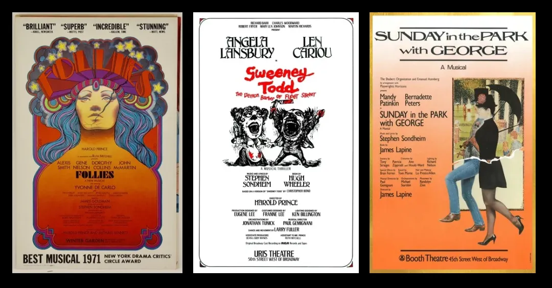
The Sondheim Hub: The original posters for Follies, Sweeney Todd, and Sunday in the Park with George share a visual language: rupture. Each establishes a relationship to damage, danger, and attention before the curtain rises. Let’s look closely at how each poster makes its promise.
3 comments:
I love this kind of content! I really enjoy designing posters in my spare time, and have helped design a lot of posters in the past few years. It’s the idea and how we present them, the designing part. I love how the article really puts the details of how the works are inspired and the developing and designing process of the 3 posters. I always struggle with the research process when so much inspiration comes to me, and to discern which ones suit the best and complement other elements. I feel like after I go through that process, everything turns super fun, and more design decisions will just flow in. However, before that state, designing is like solving a difficult research problem and planning how to tackle it. I remember watching a video of some of the best logo designs last year. The way that simple shapes and icons can express emotions in just an image or a small pixel of a logo can affect the audience’s perception of what the design is presenting and their emotions. The power behind design is super cool, and I want to learn more about the mechanisms behind how human beings let their brains work that way, and hopefully come up with more ideas for designs after being exposed to more articles like this.
Event and show posters have never gotten the full attention they deserve. They are artifacts and testaments to live artistic productions, but where musical theater posters differ from their live music contemporaries is in their unchanging nature. A rock band can have a different poster for every one of their tours or even for each show, whereas a broadway musical typically has one poster for its whole run. This makes the posters function less as advertisements or memorabilia but more like a book cover. Each of the posters mentioned in this article are inextricably linked to their productions, and have a lot to say about the shows they tout. I think the kind of artistic interpretation present in this article is sorely lacking in the artistic world. How do these shows market themselves? What do they want the audience to think or feel going into the production? All three of these posters are prime examples of how good this form can be, and I think it’s something that we should pay more attention to in the future.
I love graphic design and often it can make or break a production’s success. I enjoy the colors of the “Follies” poster. Color theory is such an interesting thing to think about especially when it comes to graphic design. The bright and fun colors of the poster share that the show itself is full of life, but the crack down the face of the woman on the poster makes it more ominous. I have never seen “Follies” but I thought about what I think the show is about before I looked it up to see if the poster did its job. Before looking it up, I figured it was about a girl who performs, but has some kind of secret or maybe does not like performing. After looking up the show and seeing what the actual plot is, I felt like I got the feelings/ideas right even though I did not exactly get the plot right which is impressive (for the designer of the poster) that I was able to get that from just the poster.
Post a Comment