Community, Leadership, Experimentation, Diversity, & Education
Pittsburgh Arts, Regional Theatre, New Work, Producing, Copyright, Labor Unions,
New Products, Coping Skills, J-O-Bs...
Theatre industry news, University & School of Drama Announcements, plus occasional course support for
Carnegie Mellon School of Drama Faculty, Staff, Students, and Alumni.
CMU School of Drama
Monday, October 03, 2022
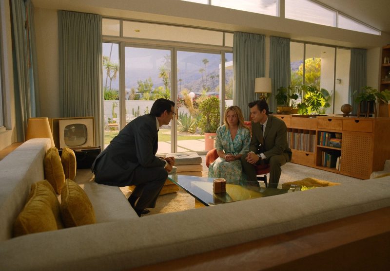
The mid-century architecture and furniture of Don't Worry Darling
Film and Furniture: Olivia Wilde’s new movie Don’t Worry Darling has been attracting attention not only for its high profile cast (including Harry Styles, Florence Pugh and Chris Pine) but also because of its dreamy locations and stunning mid-century film sets. Basically, we’re talking nothing short of mid-century design porn here.
Subscribe to:
Post Comments (Atom)

3 comments:
I got to watch Don’t Worry Darling during it’s opening weekend … I thought it was “mid”. I really wanted to love it but I walked out feeling initially very enlightened and then oddly disappointed. I do agree however that the set and costumes designs were gorgeous. I remember sitting in the movie theater, watching the movie, and thinking to myself that it was odd how most but not all of the elements were form the 1950s. You could see the elements that were off; though subtle noticeably to perhaps most audience members who know the basics of the trends from those years. I think a lot of attention that should have gone talking about the design was directed at the cast and the drama behind the scenes, which I’m a little disappointed about. It made me feel uneasy how perfect it was, especially once you get further into the movie and it is very clear how not perfect everything is.
4. I do not like horror movies so whenever there is a new one I typically know absolutely nothing about it until it becomes some worldwide sensation like Midsommar was. Don’t Worry Darling, however, has been talked about so much regarding the on set drama that I am actually vaguely aware of it. I have mostly heard pretty negative reviews, but after reading this article, I can see how the production designer went above and beyond. I agree that all of the material choices create a dissonance between the comfort of the fabrics and colors of the 50s and the uneasiness brought on by materials like glass. I also think the slight anachronisms are smart and effective in creating something familiar but slightly out of place. I think the issues with this movie run deeper than anything even the best production designer could solve. The plot itself is what I see being criticized as lazy and underdeveloped.
I haven’t seen it yet and despite all of the funny drama around the movie, I’m really excited to actually watch it, if not only for Florence Pugh haha. Because I want to judge it! I want to see if it’s actually good or if it was just hyped up too much because it was pretty and it had Harry Styles in a role that makes him look like he could be your husband and everyone who is into him immediately went feral. But like all of the different eras and different parts of history behind the film and why it’s all so effective and meaningful in the movie is always interesting to me. How Olivia Wilde connected design concepts to a story sounded wonderful, on page. I just really hope it’s actually a good movie and I’m not just hate watching it to be a part of it, yknow?
Post a Comment