Remodeling: Color takes over our world. We ask people why they feel blue and call them yellow when they’re scared; we see red when we’re angry and turn green with envy. We mix, match, coordinate, blend, and pop colors in both our clothes and our homes. Color lets us express ourselves.
5 comments:
I was on the phone with my sister the other day. My parents enjoy remodeling the house and painting and shopping at Ikea for new bathroom sinks. Anyways, last week my dearest parents re-did the office. My sister was telling me about all the trials of the job (my father put a finishing nail through some of the plumbing, there was a small fire, etc.) and she made the joke that my parents painted the room, when it was done, beige. This is funny because the family room, front hall, master bedroom, master bath, basement, utilities room, and half-bath are all the exact same shade of beige. The few rooms that are not beige are either a muted green=grey or a purple-grey. I guess my parents decided that beige was the color to represent them.
It is kind of funny how much color says about us. My parents seclude themselves behind neutrals. Three of my grandparents live in pastels. Two others surround themselves with 50 shades of red-tones. So many of the companies in this article restrict themselves to a few neutral colors (what is it with the neutrals?) Greys and whites and a sad muted pink. Why can't we all be like Behr? Why can't we live out loud surrounded by bright variation and options?
This also can be applied to campus buildings. Sure Purnell is mostly off-white, but we have murals everywhere. It provides variation, a landmark for navigation, and it says something about the students here. In comparison, we have Wean, every floor and room are almost identical. For such a colorful and passionate university, shouldn't our buildings reflect our traits, rather than try to drown us in concrete and wood paneling?
I found the Behr entry at the end of this article very refreshing. Not only are their colors of the year not as muted but they don’t try and tell you how to use their paint. All of the other entries had something about how to make it look as professional as possible or how their color was the best and then there’s Behr who just going “do what ever you want with it, as long as its pleasing to you then you’re doing it right.” Beyond me just finding the other companies in this article kind of stuffy (I really do think it had to do with their design tips seeming like they were telling me how and when to use their paint, does that make me incredibly petty? Yes, I guess it does) I do wonder how all of them except Behr chose such muted colors. It sounded like they were all looking at similar sources of information, and the other companies were similar enough for me to believe that, but then Behr is just totally different.
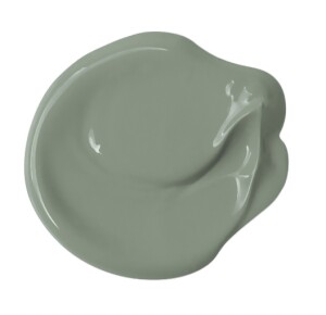
When we were apartment searching this year, Kim and I went to a house the had the Paradise Found color on many of the walls and we talked to realtor about why it was such a great color- better than the usual cream you see in apartments. I really like it because it’s a happy color- the green-blue mix- but it is muted so it’s not as hard on the eyes when you see it a lot. The same can be said for the two Pantone colors. I don’t know how I feel about the Pantone colors. I think I don’t like the pink as much simply because I don't like pink very much in general. But the blue is a great, calming color with just a little purple to warm it up and make it look better with the pink. I have to agree with Noah about the design tips after each color got campy and annoying because it sounds like they are just trying too hard to be hip and cool. The Behr tip instead is the only one that encourages you to combine and experiment with their colors.
I’ve always been amazed with how much color does to invoke a certain emotion or atmosphere. It’s crazy that certain colors and color palettes become more or less popular year to year, even though most people don’t think consciously about color in terms of how much or how little it is used, or even about the complexities and various tones of each color. I think it’s interesting that both Sherwin Williams and Benjamin Moore picked a shade of white as their paint color of the year. I think this reflects on how a lot of consumers have been searching for serenity and simplicity in an all- too chaotic and complex world. It’s also interesting that PPG’s color of the year was reflective of the military, showing how people are starting to value a sense of strength and resistance in their colors. I think green has also always had a sense of natural peace and serenity while being a bit more emotional than pure white. Perhaps the most unique color choice is Pantone’s pink and periwinkle blue, which reflects the blurring of the strict divide between what is considered feminine and masculine. I think we tend to usually think about color as something inherent in our society, without considering it as something that has the power to inflict emotional or social change. As potential theater designers, I think it is so important to remember the importance of color in inducing mood.
I find these color and palette selections to be a very interesting and unexpected reflection on the times around us. The fact that so many of these colors seek to inspire "tranquility" and "stability" is very reflective of our currently tumultuous social, economic, political, and international worlds. This is an interesting metric to measure this deep search for calm that is becoming more widespread with every new crisis.
Apart from the larger implications of these color selections, I find it interesting how Pantone selected two colors, and Behr developed an entire palette. I think this promotion of color interactions, and awareness of how two colors can relate, is exceptionally valuable. So too, I find the emphasis on white by several companies to be novel. Much of what is designed or painted is based off of a foundation of white. I find the elevation of white from mere evaluative tool to color in its own right an interesting step in the design world.
Post a Comment